

A couple of weeks ago, we explored how to identify weak spots in your process using the four detection rules. Today, let’s dive into how to apply these rules specifically to analyze your cycle time with the Process Improvement Dashboard. By the end of this article, you’ll know when is the right time to optimize your process and when the variation of your cycle time is just normal (all backed by data!)
How to Use Natural Process Limits to Monitor Cycle Time
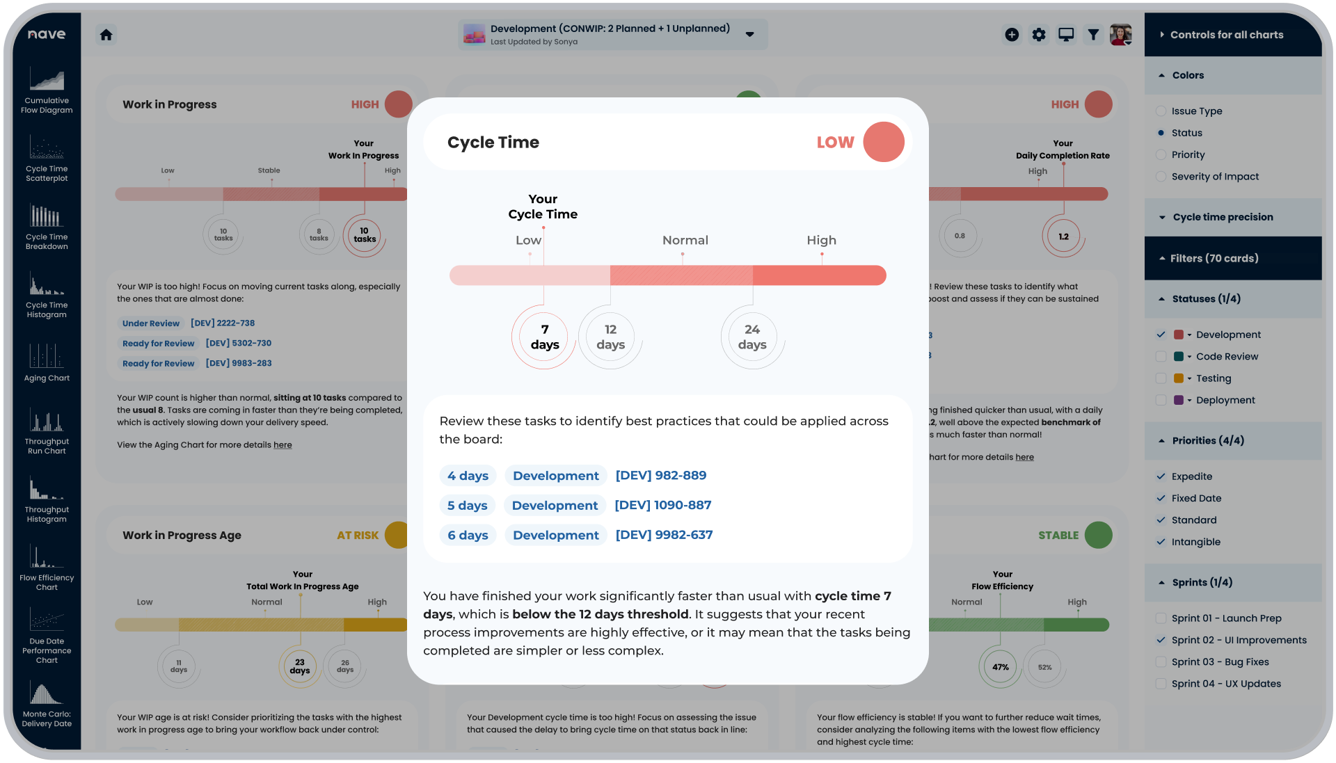
First things first, let’s recall how to put together your natural process limits. We calculate your limits using data from the last 20 completed items. They serve as benchmarks for detecting any deviations that may require attention.
To dig deeper into how to calculate your natural process limits, check out our step-by-step guide here →
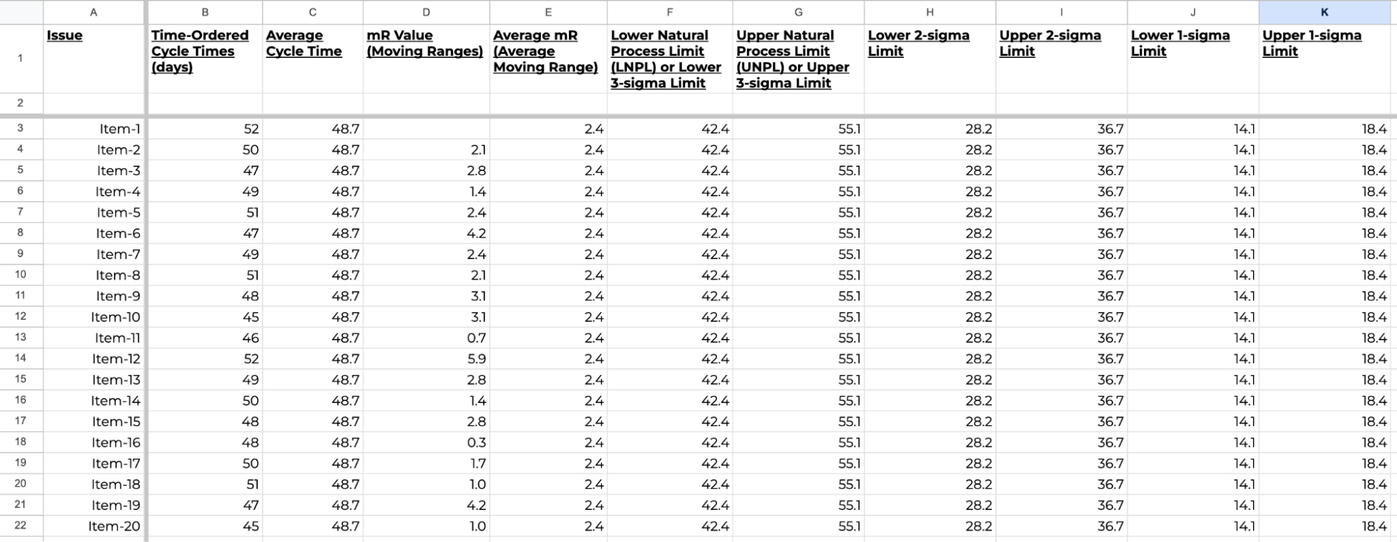
In the Process Improvement Dashboard by Nave, you’ll find a cycle time widget that visually represents these limits.
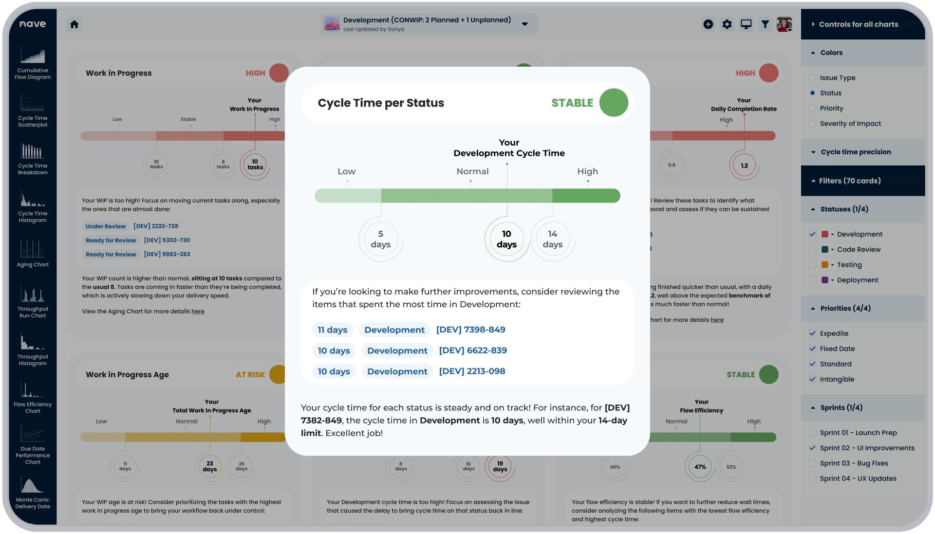
When no signals are detected, the status is marked Stable, indicating that your cycle time stays within the normal variation of your process.
What does this mean?
When your cycle time is stable, you can use approaches like Monte Carlo to forecast your delivery times, as the chance of you hitting these targets will be quite high.
Now, if you’re not completely delighted by the numbers you see, the Process Improvement Dashboard also provides a list of tickets with the longest cycle times for you to further dig into. You can then identify potential opportunities for improvement.
We’ve also included a quick link to the Cycle Time Scatterplot to track how your cycle time evolves over time.
When to Act on Cycle Time Deviations
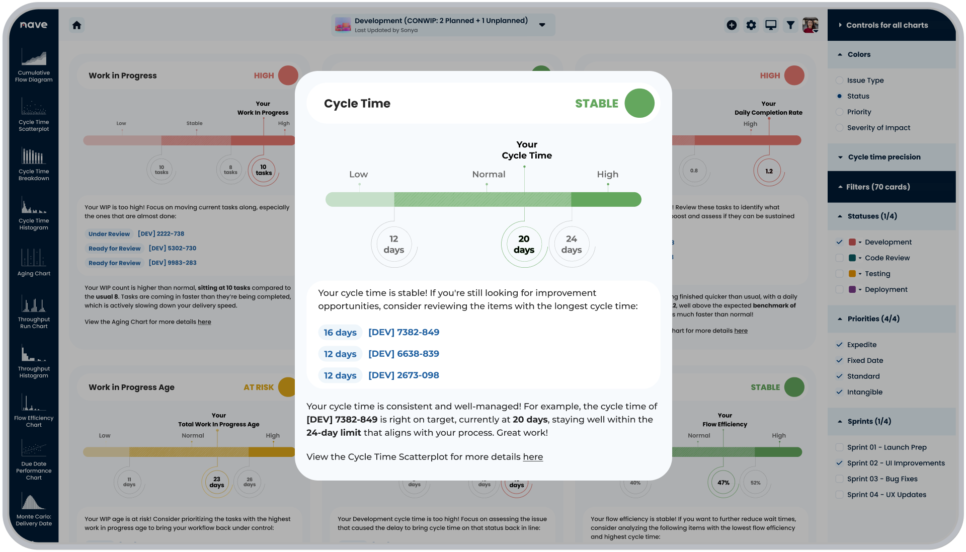
So, when is the right time to make changes in your process? The best time to take action is when a signal is detected—meaning a significant deviation from your typical cycle time has occurred.
When a signal occurs, such as a cycle time that exceeds your natural process limits, the dashboard marks the status as High. This is a clear indication that immediate action is needed.
To make this easier, the dashboard highlights the specific work items that triggered the signal in the action items section. Addressing the root cause of the deviation is critical here, and your process is no longer stable and your ability to make reliable delivery predictions has been compromised.
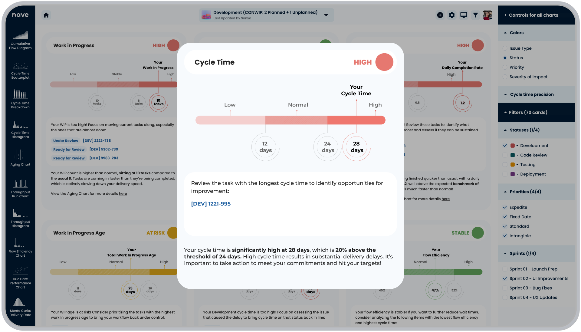
Now, signals aren’t always about delays—sometimes, they reveal unexpected reduction in your delivery times.
If the cycle time of recently completed items falls below the natural process limits, it suggests that things are moving faster than usual. This could indicate that recent process improvements have been effective or that the tasks being completed are less complex than usual. Either way, it’s worth a closer look as this signal still represents an unusual behavior and makes your process unpredictable.
In the Process Improvement Dashboard, you’ll find a list of all the items that triggered the signal so you can analyze why cycle times have improved and identify best practices that could be applied across the board.
What to Do When a Process Step Cycle Time Triggers a Signal
Understanding cycle time at a high level is great, but sometimes, you need to dig deeper.
The Process Improvement Dashboard lets you break down cycle time by individual process steps. This helps you see exactly where time is being spent and identify which stages might be slowing things down.
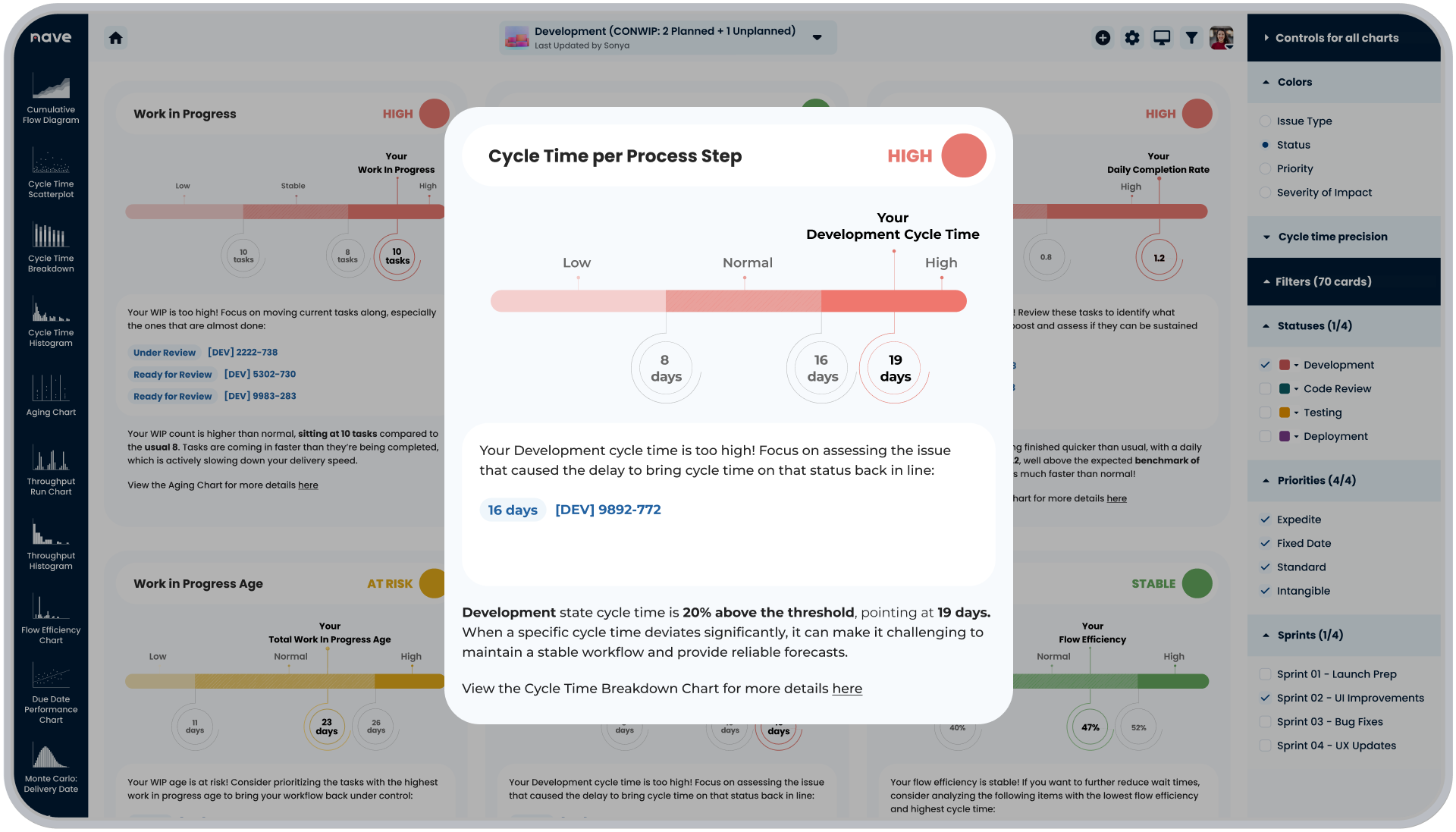
For instance, you’ll see the time a recently completed item spent the most in a certain step and how it compares to the natural process limits for that step. If a particular stage triggers a signal, it’s a clear area for targeted improvement.
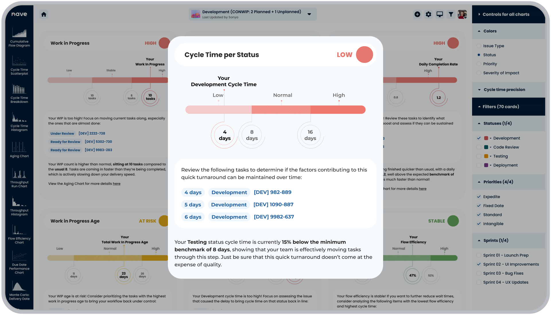
Conversely, if a stage is consistently faster than expected, it’s worth investigating why. If a signal shows that time spent in a particular stage is below the natural process limit, it’s important to verify that this faster processing isn’t compromising the quality of your results.
We’ve also included a shortcut to the Cycle Time Breakdown Chart to enable you to dig deeper into how your process step cycle time looks like over time.
By following this approach, you can confidently determine when changes in cycle time indicate a need for action and when they’re just part of your process’s normal fluctuations.
The Process Improvement Dashboard provides a clear list of actionable items, helping you make targeted adjustments that keep your process on track and aligned with your goals.
Next week, we’ll continue our deep dive by exploring how to detect signals in throughput using the Process Improvement Dashboard. Stay tuned for more data-driven managerial insights!
I hope this guide has been helpful! See you next Thursday, same time and place. Bye for now!
