

Hey there!
If you caught my last post, “Cycle Time Spikes? Here’s Why You Shouldn’t Panic Just Yet”, we talked about how not every fluctuation in your flow metrics is a crisis. We covered how natural variation is part of the process and how constantly reacting to every spike or dip can actually do more harm than good.
Now, I know what you’re thinking—how do you tell the difference between normal variation and a real issue that actually needs your attention?
Great question, and that’s exactly what we’re diving into today!
So, let’s pick up where we left off. You’ve got your flow metrics in front of you. Your cycle time is fluctuating and you’re left wondering: “Is this normal? Or do we need to address it and take action?”
That’s where setting boundaries around your data comes in. These boundaries help you figure out what’s just part of the usual ebb and flow, and what’s signaling something’s off and requires your attention.
Variation happens in every process but when you see a spike or a dip that’s outside of what you expect, that’s when you should start investigating.
How to Draw Boundaries Around Your Data
Here’s the key to staying on top of your flow metrics: setting what’s called natural process limits. These limits will help you separate normal variation from exceptional changes in your process.
Here’s a step-by-step guide on how to calculate your natural process limits for cycle time:
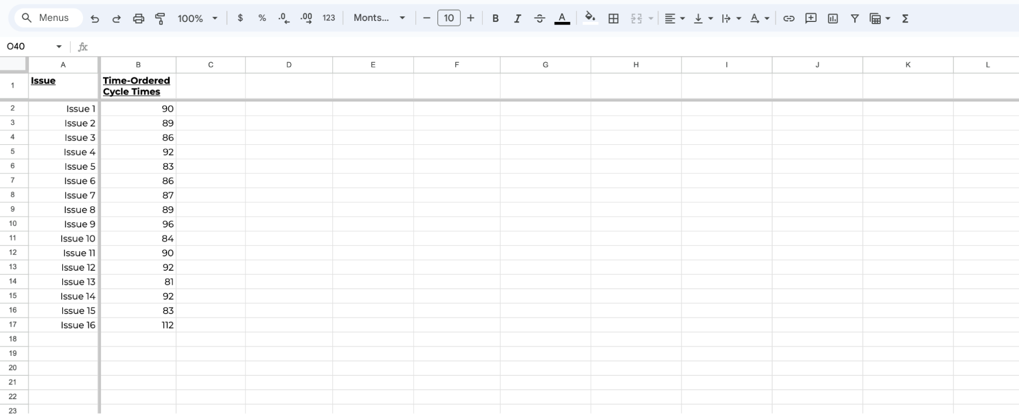
1. Gather Your Data: Start by taking a set of the most recent completed items and listing them in a column in Excel.
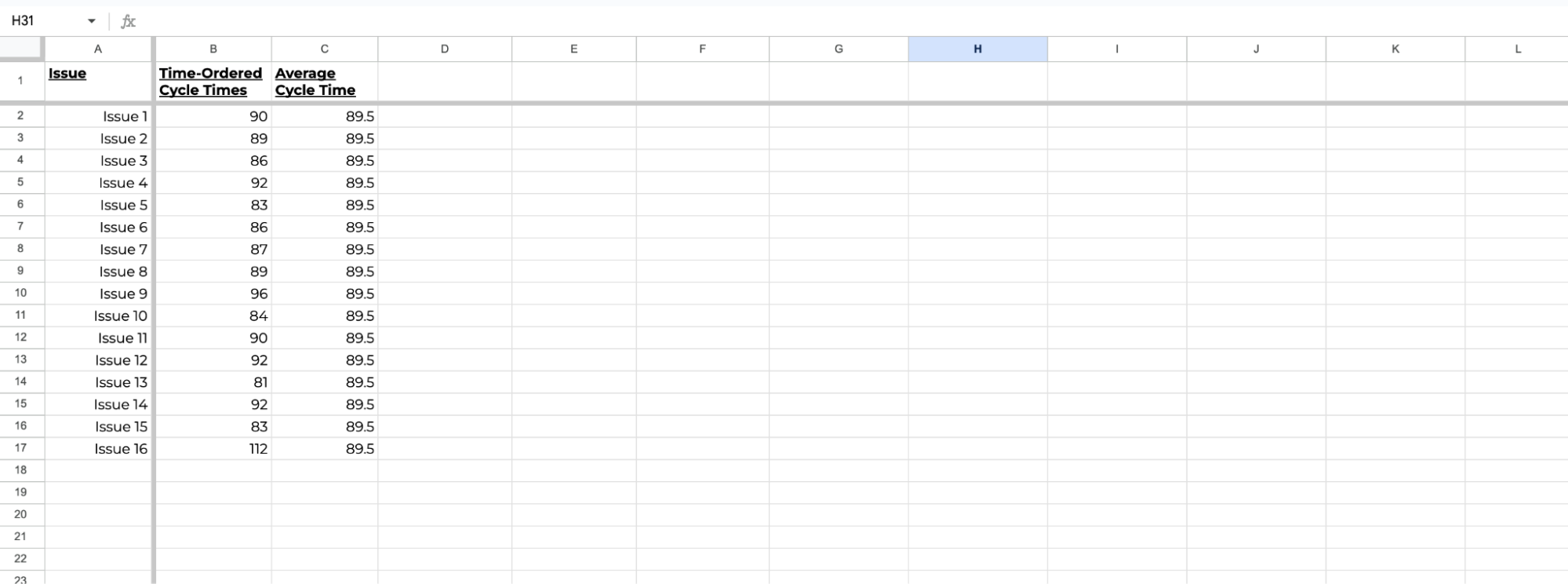
2. Calculate Your Average Cycle Time: In the next column, calculate the average of all the cycle times.
3. Calculate the Moving Range: In the next column, calculate the difference between each pair of consecutive data points. This shows how much variation there is from one completed item to the next.
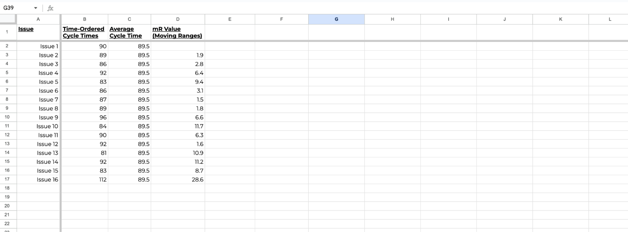
4. Find the Average Moving Range: Once you have the moving ranges, find their average. This gives you a sense of your process’s natural variation.

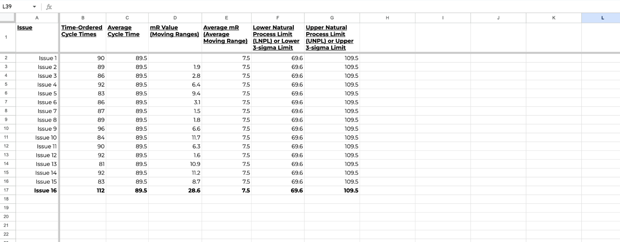
5. Set Your Limits: Finally, multiply the average moving range by 2.66, then add that to the overall average to get your Upper Limit and subtract it to find your Lower Limit
Natural Process Limits = Average ± 2.66 × Average Moving Range
If you’d like a copy of this spreadsheet, reach out to me on LinkedIn and I’ll share it with you!
So, When Should You Take Action?
Now that your limits are in place, it’s time to put them to good use. If your data points stay within those limits, this means that your process is stable, and there’s no need to make any sudden changes.
But if something falls outside those boundaries, like item 16 above, it’s your cue to dig deeper and see where the opportunity for improvement is.
It’s as simple as that!
And if you’d like to see this in action with your own data, go ahead and check Nave’s Process Improvement dashboard. It’s free for 14 days, no strings attached →

Agile teams across the globe use the Nave Analytics suite to identify opportunities for improvement and deliver better products faster!
In the next article, “How Much Data Do You Really Need to Set Accurate Process Limits?”, we’ll go even deeper into how much data you actually need to calculate these limits and take full control of your process.
Until then, keep calm, and let the data be your guide!
Thanks for tuning in, and I’ll see you next Thursday, same time and place for more managerial insights!
Bye for now!
Source: Vacanti, D. “Actionable Agile Metrics for Predictability Volume II”
