

This week, we had a chat with Pawel Lewinski, a Scrum Master and Accredited Kanban Trainer who helps organizations optimize their processes and ultimately improve their business outcomes.
Pawel has been using Nave for about six months now, and the results he has managed to achieve in such a short period utilizing the platform are really impressive!
You’ll be astonished by how small tweaks can lead to massive improvements. So, without any further ado, let’s dive right in!
How to Overcome Initial Data Visibility Challenges
Pawel’s teams use Jira to manage their processes. However, they faced significant challenges that hindered their performance:
“We are using Jira, and the main issue with it is that it doesn’t give us any visibility to flow metrics. The data is there, but we cannot actually see it in an easy way,” Pawel explained.
The lack of visibility into the metrics he wanted to track with his teams forced Pawel to manually extract data into Excel. This process was time-consuming and prone to errors.
“I was forced to either use what was there, which was not perfect, or copy stuff to Excel, do it manually, and create all the formulas.”
This manual extraction and analysis of data were really inconvenient.
“It was not very convenient because it was also pretty limited in access for people and not very useful,” he added.
Additionally, certain metrics, such as WIP aging, were impossible to track accurately using Excel. This limitation prompted Pawel to search for a more effective tool that could support his teams and streamline their workflow.
The Role of the Nave Analytics Suite
Pawel set out to find a tool that could improve data visibility and better support his teams.
He tested various solutions but found most to be either too simplistic or lacking in necessary functionality. Nave’s analytics solution stood out due to its comprehensive metrics, ease of use, and appealing visual design.
“What I like about Nave is how easy it is to get started with, and it provides almost everything I was looking for in terms of metrics,” Pawel noted.
The visual aspect of Nave was also a significant factor in his decision.
“It has a nice design. I like to see things in a nice way,” he said.
The ability to present metrics in an aesthetically pleasing manner was important for Pawel, especially when sharing information with business stakeholders.
How Pawel’s Teams Improve Their Delivery Times by 30% (in Just a Few Weeks!)
Despite implementing Scrum, Pawel incorporated flow metrics, typically used in Kanban, to gain insights into his teams’ processes. By focusing on the most important metrics of every agile team, WIP aging, Pawel and his teams could identify and address what was slowing them down.
“Flow metrics fit pretty well for Scrum teams and are actually very useful,” Pawel explained.
The adoption of flow metrics provided immediate benefits. One of the most significant improvements was the reduction in delivery times.
Pawel’s teams improved their 85th percentile delivery time from 33 to 22 days within a month!

Agile teams all over the world utilize the Cycle Time Scatterplot by Nave to track their time to market.
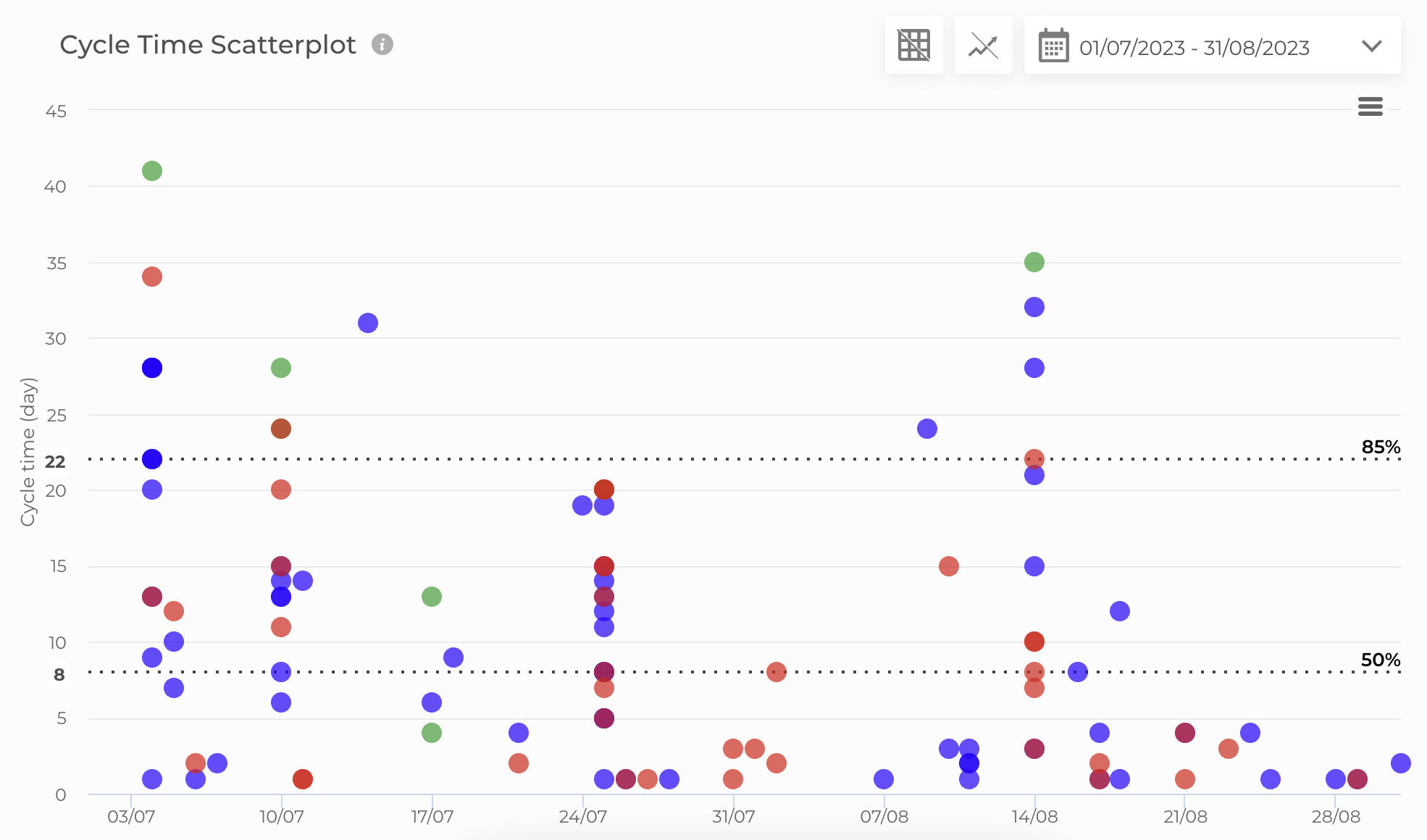
Pawel’s team managed to improve their delivery times by 30% (in just a few weeks!) Try Nave’s analytics suite now, it’s free for 14 days→
“Just by using the Aging Chart, we reduced delivery time by ten days in a month,” he highlighted. This improvement was achieved without altering existing processes, proving the major impact that better visibility and data-driven decisions had for them.
The Secret Behind Enabling Continuous Improvement
On a day-to-day basis, Pawel’s teams use the Aging Chart by Nave during their daily stand-ups to trigger the right discussions at the right time and ensure tasks move efficiently through the workflow. This practice has significantly reduced overlooked tasks and improved the flow of work.
“When I joined the team, the daily stand-ups were like, ‘Okay, I’m working on a, b, c,’ and everyone was just syncing on what they were individually doing. Nobody was looking at the whole picture of what was going on with tasks or the team’s progress,” Pawel recounted.
Pawel’s teams developed a more holistic view of their workflow by integrating the Aging Chart into their daily standups.
“Right now, we as a team are focused on moving the work forward,” he said. This shift in focus led to more efficient workflow management and reduced delivery times.
During retrospectives, the teams analyze their Cycle Time Scatterplot and Breakdown Chart to identify bottlenecks and areas for improvement.
“We use the Cycle Time Scatterplot and Cycle Time Breakdown chart during retrospectives to get a bigger picture of the current situation,” Pawel explained.
These charts help the teams understand where time is being consumed in the process and identify opportunities for improvement.
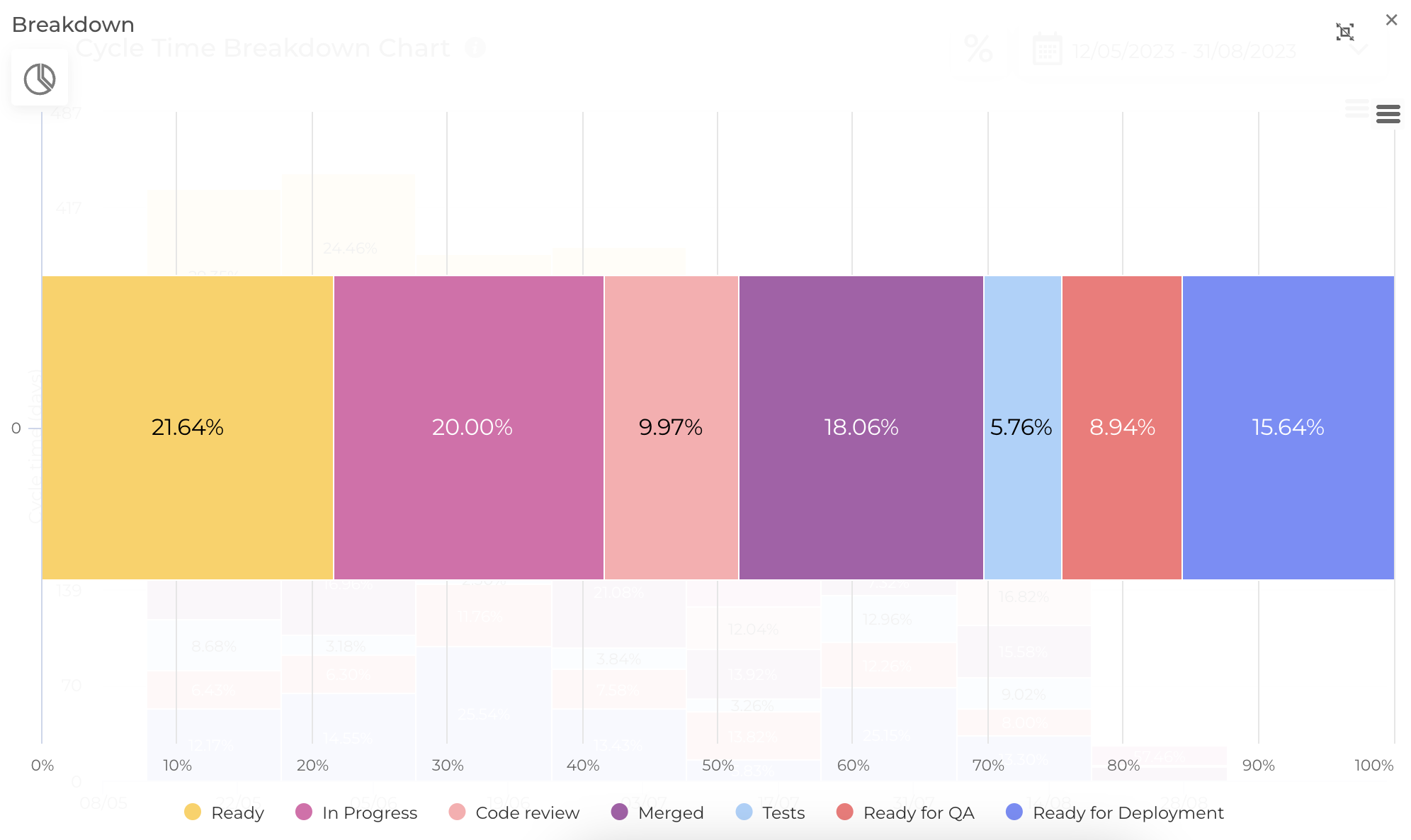
Agile teams use the Cycle Time Breakdown chart by Nave to identify where their work spends the most time. See a dashboard with your data now →
For example, they noticed that tasks spent a significant amount of time in the “Ready” column, prompting them to be more cautious about committing to work.
The Shift to Strategic Goals
The flow metrics provided by Nave also inspired strategic changes within Pawel’s teams.
One notable initiative was the introduction of a hackathon approach, where the team focused on a specific task for a short, intensive period.
This approach demonstrated the value of focused work and led to changes in how the team planned and executed their work.
The data from Nave supported these strategic discussions and helped the team prioritize tasks more effectively.
“With the support of the metrics, it sparked a very interesting discussion within the team,” Pawel noted.
By focusing on completing one task before starting another, the team was able to improve their workflow and reduce the time tasks spent in the system.
“Thankfully, we don’t have to report metrics to top management. The focus is entirely on delivering value,” Pawel explained. Metrics serve as a tool for the teams to drive continuous improvement.
The impact of Nave’s analytics suite on Pawel’s teams is evident in the tangible results they have achieved.
Here’s your action item: If you haven’t integrated Nave with your management platform yet, now is the time. It’s free for 14 days, no strings attached →
It took less than a month for Pawel to provide a clearer view of their workflow and enable data-driven decision-making, ultimately resulting in 30% faster delivery times!
If they can do this, you can do this too. So, don’t hesitate any longer, go ahead and create your dashboards now!
Then send me a note to let me know what you’re seeing. I’m on LinkedIn, and I’m looking forward to hearing about all the insights you reveal using our analytics suite.
P.S. Pawel looks forward to further leveraging Nave, particularly in areas like probabilistic forecasting, to continue driving improvements.
“We are just starting with probabilistic forecasting, but it is the very beginning of using it. Hopefully, next time we speak, we will be further along, and I will be able to tell you that we are using Monte Carlo forecasting to plan our work in the bigger picture,” he says.
Exciting times!
I hope Pawel’s story has inspired you to take the next step in your continuous improvement journey! I wish you a productive day ahead, and I’ll see you next week, same time and place, for more managerial insights. Bye for now!
