

Today, I want to share some insights on how to improve your flow efficiency analysis as a Kanban practitioner. If you’re keen on identifying the bottlenecks with the highest impact on your performance, keep reading.
Here’s the thing:
When we try to detect bottlenecks in our process and identify opportunities for improvement, it makes sense to look at the tickets with the lowest flow efficiency.
And we’d use the Flow Efficiency Chart for that purpose.
Agile teams use the Flow Efficiency Chart by Nave to track how much time their work is staying and waiting in their process. Give it a try now, it’s free for 14 days, no strings attached →
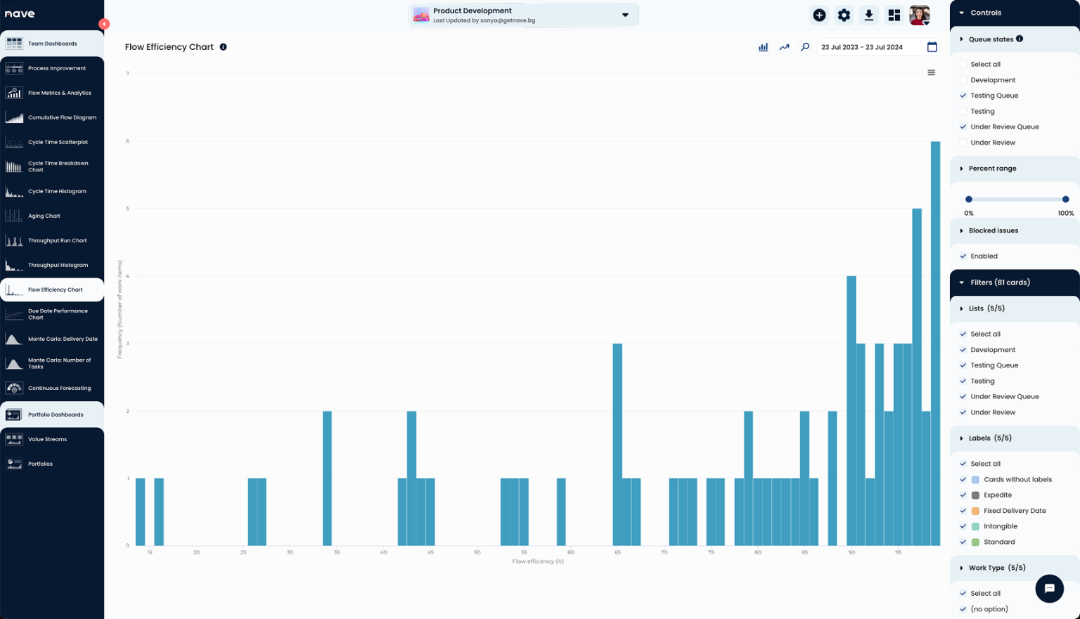
The histogram is very useful to see the work items with the lowest flow efficiency. But often, cards with low flow efficiency also have very low cycle times.
For example, imagine a card with a cycle time of only 2 days. If it was waiting for 1 and a half days, it would show 25% flow efficiency. That’s not particularly interesting for the team to improve.
What’s more interesting is a card that has 25% flow efficiency and a cycle time of 8, 10, or 15 days. So, how do we filter out cards that have lower cycle times?
Here’s How to Improve Flow Efficiency Analysis
When performing flow efficiency analysis, it’s important to focus on the tickets with longer cycle times and low flow efficiency.
And the easiest way to achieve that is to convert the histogram to a scatterplot.
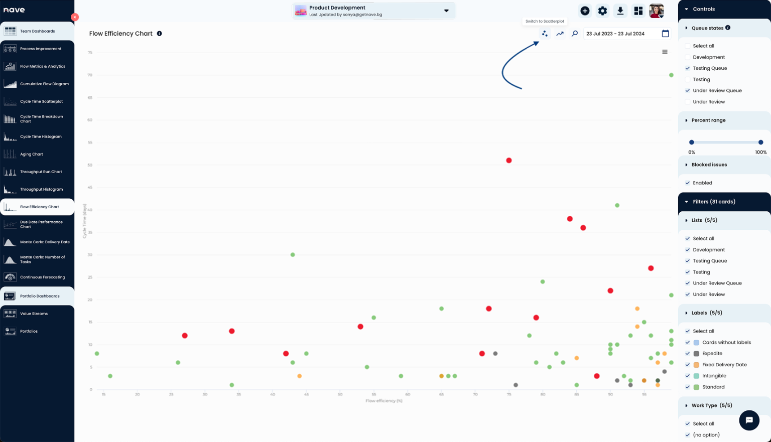
Use the switch button on the top right side of your chart at Nave to convert the Flow Efficiency Histogram to a Flow Efficiency Scatterplot!
The Flow Efficiency Scatterplot shows Flow efficiency % on the X-axis and Cycle time on the Y-axis. Now, with that visualization, you can cross-reference a task’s flow efficiency and cycle time.
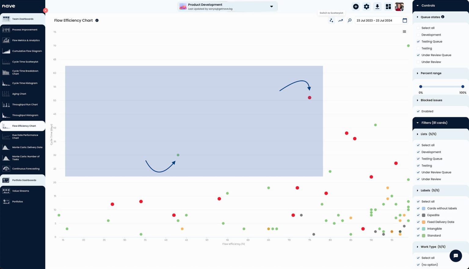
The work items on the top left part of the screen are those with the highest cycle time and lowest flow efficiency. These are your best opportunities for improvement.
By enabling the scatterplot feature, your teams will be able to address opportunities for improvement quickly. At the end of the day, taking action is what matters the most.
Take your analysis to the next level!
Once you have identified the key areas for improvement using the scatterplot, the next step is to implement changes and track their impact.
Once you prioritize the work items in the top left quadrant of your scatterplot, discuss what caused the long cycle times and low flow efficiency and brainstorm potential solutions.
Put your initiatives into practice and use Nave’s analytics suite to monitor the impact over time. Adjust your strategies as needed.
One last tip:
Don’t forget to celebrate your wins. As you see the needle moving in the right direction, make sure to celebrate these milestones with your team. Recognizing success keeps everyone motivated and committed to continuous improvement.
Join the Community of Agile Teams
You’re not alone in this journey. Over 7,000 agile teams are already benefiting from the powerful insights provided by Nave. By leveraging these tools, you’re setting your team up for success.
So that’s it, my fellow Kanban practitioners. If you want to elevate your flow efficiency analysis, consider this feature. And if you found this useful, please share it with your team or anyone else who might benefit.
Thanks for tuning in, and I’ll see you next time! Have a great day!
